

EPG (Guide TV)

Consumer habits are changing from linear to on-demand, traditional closed set-top boxes to an ecosystem of connected devices and stationery to
on-the-move access.
That was a project to create an EPG (TV Guide) for iPad prioritizing customer satisfaction following the client requirements:
Show a suggestion of what an EPG could look like if they choose not to go with the ROVI patent. They still want an EPG that gives you a good overview and a rich visual experience.
Design Process

BRIEFING
RESEARCH
EXPLORATION
DESIGN
FINAL DESIGN
DELIVERY
UNDERSTAND
THE PROBLEM
ROVI PATENT
HEURISTIC REVIEW
INSPIRATION BOARD
USER TEST
FEATURES
CARD SORTING
FLOWCHART
SITEMAP
SKETCHES
WIREFRAMES
INFORMATION
ARCHITECTURE
INTERACTIONS
TEST
ADJUSTMENTS
ICONS
(STYLE / NEW DESIGN)
TYPOGRAPHY
COLOUR PALETTE
IMAGES
UI PROPOSE
VISUAL
PRESENTATION
This is my basic process for creating any material. It involves the steps above that can be followed slightly differently according to each goal. In some situations, the process may be changed to better fit the project.
Competitor analysis

In this research, I looked at the market leaders to analyze their features and see what best fit the customer needs. I went through a long process that resulted in the feature's choices and how the product would behave, always trying to find the best UX and a smooth UI


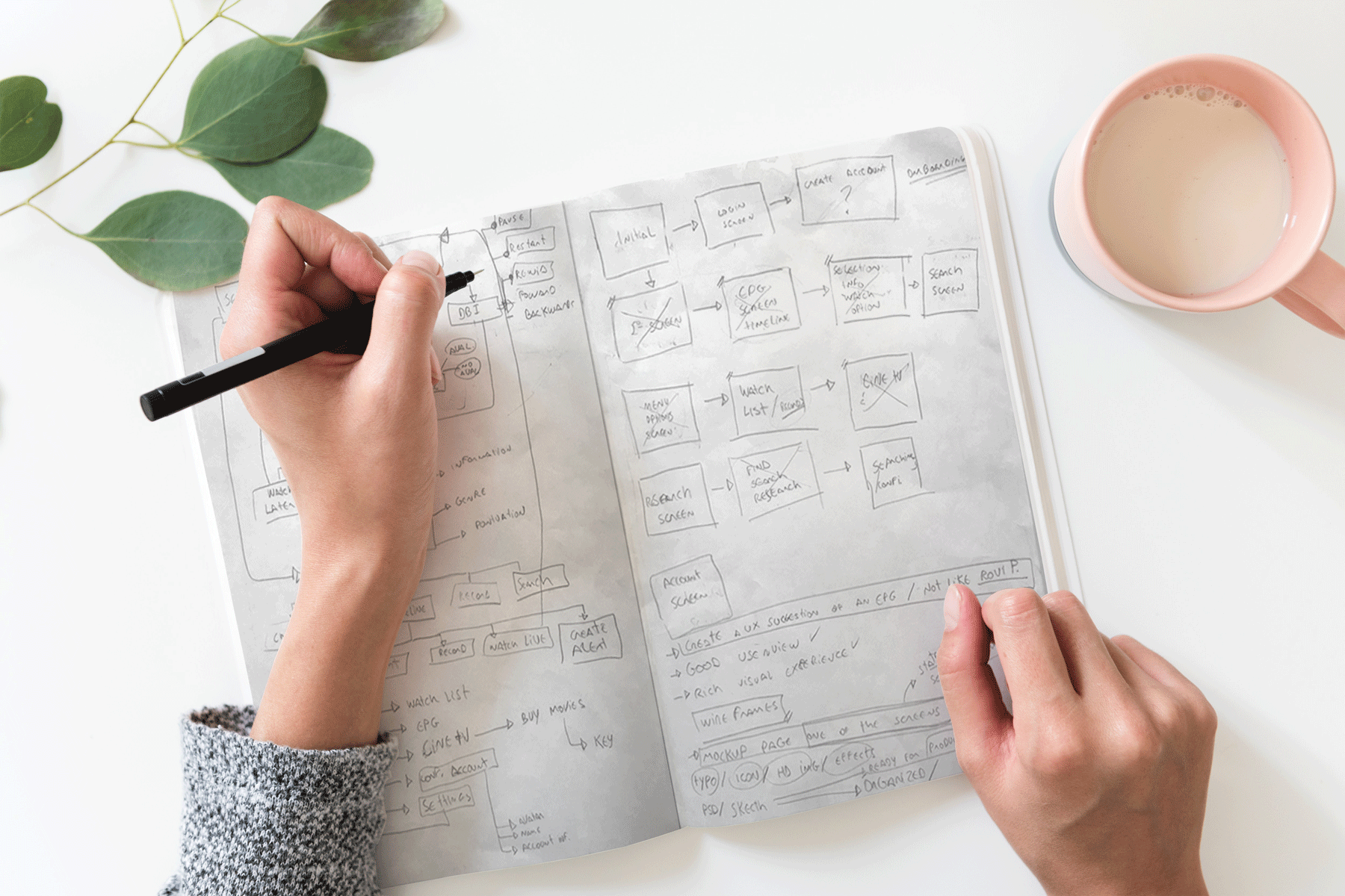
Planning and sketches

Flowchart study


Wireframes

Genre movie Icons:
Materials include vector illustrations that I've created myself
and some adaptation from another icon library.



Colour Palette:
Principal Color extracted from the logo.
I choose a similar palette to keep it clean
and visually appealing, and
complementary accent colours for
things to pop-up.
Buttons:
Style: Linear - clean, light, soft
Rounded corners size: 6
Width inside size: 1

Showcase image


